Tuesday, September 30, 2014

Awesome Past and Future Sentinels X-MEN DAYS OF FUTURE PAST Concept Art by Jon McCoy

X-Men: Days of Future Past (2014) concept art by Jon McCoy
Check out X-Men: Days of Future Past concept art by Jon McCoy!

When talking about the design of the Sentinels for the latest X-Men movie director Bryan Singer told Collider, "Well the Sentinels of the past, it’s not, I mean, I have to say, there are movies like Transformers, and Iron Man, and Pacific Rim, that have already explored robots of all different sizes and shapes and scope and caliber, I knew that to make another robot attacks people or hero movie is not- yet they are an element in the picture." He also said, there was a challenge in following up on the legacy of the comic books saying, "Well we tried to make the ones from 1973, the Sentinels of the past, a little fun and stylish but also a little retro, and the key is they’re not made of metal. That’s very important to our story because we’ve got a very powerful mutant. So that was a challenge to, to make them look like they could be made of polymer or some other material, plastic or something, but still have them be formidable when flying around and all that." One of the artists that helped design the look of the Sentinels as well asother important elements was Jon McCoy.

McCoy is a professional concept artist who's worked on big budget films like Thor: The Dark World (2014), Wrath of the Titans (2012) and World War Z (2013).

Click on the images to enlarge.


See more of Jon McCoy's beautiful portfolio at http://www.jonmccoyart.com.

Click on the links if you want to see more of Jon McCoy's work or X-Men: Days of Future Past artwork on my blog.

via Comic Book Movie (Nailbiter111)

What do you think of the concept art? If you've seen X-Men: Days of Future Past what do you think of the Sentinels?

Official X-Men: Days of Future Past Summary
The ultimate X-Men ensemble fights a war for the survival of the species across two time periods in X-MEN: DAYS OF FUTURE PAST. The beloved characters from the original “X-Men” film trilogy join forces with their younger selves from “X-Men: First Class,” in an epic battle that must change the past – to save our future.
Directed by Bryan Singer
Cinematography by Newton Thomas Sigel
Production Design by John Myhre
Starring: Hugh Jackman, James McAvoy, Michael Fassbender, Halle Berry, Anna Paquin, Jennifer Lawrence, Ellen Page, Peter Dinklage, Ian McKellen, Patrick Stewart
Release date: May 23, 2014 (USA)
Official Site: www.X-MenMovies.com
© Copyright 2014 20th Century Fox, Marvel Entertainment, Bad Hat Harry Productions, The Donners' Company, Simon Kinberg Production, 20th Century Fox. All rights reserved

Monday, September 29, 2014

Exclusive: Why was the Skovox Blitzer Hard to Storyboard for DOCTOR WHO? Storyboard Artists James Iles Answers

Doctor Who (2014) storyboard by James Iles
 Check out Doctor Who storyboards by James Iles!

 The eighth season of Doctor Who is off to a big start and is a hit with new and old fans of the series. io9 described last weekend's episode "The Caretaker" as Charlie Jane Anders' "favorite episode of the Peter Capaldi era of Doctor Who thus far." Part of what makes this series so special are the incredible visuals and staging of each episode and one of the main storyboard artists for the new series of Doctor Who for years is James Iles.

Iles is a UK based professional storyboard and concept artist who's worked on big budget projects like Doctor Who , The Amityville Asylum (2013) and Outcasts (2011). He kindly took some time out of his schedule to talk to me about how he got the job, working on the series and how the locations affected the storyboarding of "The Caretaker."

Click on the images to enlarge.

Maurice Mitchell: Thanks for joining me James. How did you become a storyboard artist?
James Iles: As a kid, I really wanted to work in comics. I was a big Marvel and Image fan, and I spent a lot of my time drawing. I also had a love for films, particularly anything science fiction or monster related. After school I studied illustration at university, focusing on a wide range of creative fields, from advertising to fine art, graphic design and wildlife illustration.

I grew up using traditional media, and only started using digital for the first time in my early twenties, which I think has been a massive help in as a storyboard artist. Although many artists today produce storyboards digitally from start to finish, I find that the fastest way for me to get through hundreds of shots is still with pen and paper. It's also really useful being able to pin them all on the wall and go through them with a director, adding or removing shots as you go. After university I worked on all kinds of freelance jobs.

One day I went to an interview to attend a theatre design course. The course director felt that their programme wouldn't quite offer me what I was looking for, which was predominantly concept design, storyboarding and also fabrication, so he recommended that I have a chat with a colleague of his, who turned out to be the production designer on Doctor Who, Edward Thomas. He gave me a chance to work with the Doctor Who art department, learning from some of the most talented concept artists in the industry.

Initially, I was helping them at the research stage of the design process, and also designing some of the smaller props like wrist communicators, control panels and switches, things like that. The first concept design I produced which actually made it all the way to being built and filmed was a Sontaran wrist communicator. It was a tiny prop, but a really big deal to me to see it on screen.

Eventually, I became a full time member of the art department as storyboard artist, and also working on more of the concept art. It's been over 30 episodes now, and has lead to being involved in other great productions, such as Sherlock and independent films.

MM: In the years working on Doctor Who what's the most memorable design you've worked on?
JI: In a way, it was that first, tiny Sontaran wrist comm that made it to the screen! It's a really small prop, but the feeling of being pleased with the design, and seeing it come to life via the fabrication department and make it all the way to filming gives you a real sense of achievement. Also getting to work with the sonic screwdriver from time to time has been really fulfilling, it's such an iconic piece. Also the Cyber Conversion unit from "Closing Time," that was a real challenge, trying to figure out how Cyberman armour could be applied to a person as outlined in the script.I like working with props that will be built the most, rather than created digitally, because I get to watch the fabrication department take the design and turn it into a physical prop that you can hold and examine, it's really rewarding. In terms of storyboarding,I don't think I have a single favourite episode, but I loved working on "The Vampires of Venice." It was filmed in Croatia, and the environment, plus a lot of water-based action made it a really exciting episode to develop. The environment you're working with influences the storyboards a lot, whether it's for TV, film or advertising. 

Depending on the set or location, it affects the whole thing.  Mood, lighting, set dressing, camera angles, and what you can do, action-wise, depending on how much space you have to work with. I've been really fortunate to have been involved with Doctor Who, because each episode, you could be anywhere, from Sherwood Forest to Stonehenge, ("The Pandorica Opens" is another favourite of mine).

"Time Heist" storyboards 


MM: Where there any challenges when working on "The Caretaker" and, if so, how did you overcome them?
JI: Coming back to the way sets and locations influence what you can film, working in a school was a bit of a challenge, because the Skovox Blitzer was a pretty big, physical character, that needed to be able to chase Clara and Danny around, and some of the scenes are shot in fairly small rooms. Many of the locations weren't quite decided on while we were planning much of the action, so we didn't have location photographs to work from. That's one of the challenges involved in storyboarding, you have to try and get as close as you can to the vision the director has in their head, but a lot of the time you're storyboarding at a very early stage of pre- production, when location scouting isn't always finished.So you have to work with the script and the descriptions offered by the director, and allow for some flexibility when it comes to filming.


What's next for you?
I'm working more and more on graphic novels at the moment, as well as Doctor Who. I'm also developing some of my own projects, including a science fiction comic, and a monster movie called CongAAARGH! about a giant, mutated eel terrorising a seaside town. Along with some colleagues from Doctor Who, we're currently raising the funding for our prosthetic monster via Kickstarter. I'd love to do some more storyboards for feature films, we'll see what happens!

Here's how James and his team describe CongAAARGH: "CongAAARGH! is a short monster movie about a giant, mutated conger eel being disturbed from the ocean depths to terrorise a seaside town. We've seen that before,right? But not quite like this. At least not since the 1950's.We feel that many of today's monster movies, fantastic as they are, have lost the simple charm, character and 'real-ness' of a man in a monster suit. With CongAAARGH!, we aim to help keep this great tradition of film making alive, and along the way, document exactly what goes into the process of designing, fabricating and filming a practical monster as independent filmmakers."


See more of James Iles' cracking portfolio at http://www.jamesilesstudio.com

Click on the links if you want to see more of James Iles' work or Doctor Who artwork on my blog.

What do you think of the storyboards? If you've seen Doctor Who what do you think of the series so far?

Official Doctor Who Summary
"The Doctor is an alien Time Lord from the planet Gallifrey who travels through all of time and space in his TARDIS. His current travel companion is Clara Oswald, though he has a long list of friends and companions who have shared journeys with him. Instead of dying, the Doctor is able to "regenerate" into a new body, taking on a new personality with each regeneration. Eleven actors, plus John Hurt, have played the Doctor thus far."
Created by Sydney Newman, C. E. Webber and Donald Wilson
Official Site: http://www.bbc.co.uk/programmes/b006q2x0
Original Air Date: 23 November 1963 (UK)
© Copyright 1963 British Broadcasting Corporation (BBC). All rights reserved


Friday, September 26, 2014

Spend an Hour with Andrew Probert in Video Interview by Sycra


Check out this wonderful video interview by Andrew Probert!

Every Friday I feature artwork from a classic of science fiction cinema. This week's "Flashback Friday" post is on the master concept artist Andrew Probert.

Recently I came across a wonderful interview with concept artist Andrew Probert. He spends almost an hour talking about his career and life and is well worth an hour of your life. Sycra makes "art videos that inspire, instruct, and entertain."

Andrew Probert is a professional concept\storyboard artist who's worked on classic Hollywood movies like Back to the Future (1985), Battlestar Galactica (1978) and Star Trek: The Motion Picture (1979)

In this interview he talks about drawing in his dictionary as a child, not sleeping in art school and cold-calling Ralph McQuarrie.

Click on the video to watch more.


See more of Andrew Probert's marvelous portfolio at http://www.probertdesigns.com and see more art videos at Sycra Art Videos.

Click on the links if you want to see more of Andrew Probert's work on my blog.

What do you think of the video? If you've seen Andrew Probert's work what do you think?


Thursday, September 25, 2014

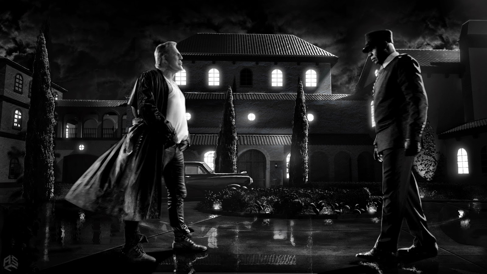
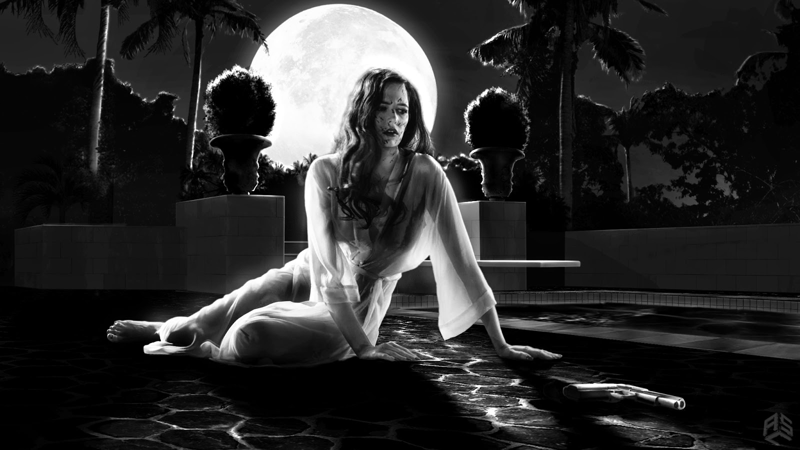
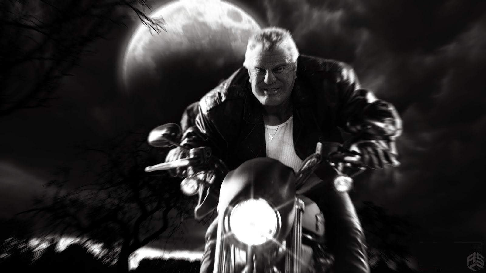
SIN CITY: A DAME TO KILL FOR Concept Art by Aaron Sims Company


Check out Sin City: A Dame to Kill For concept art by Aaron Sims Company!

Sin City: A Dame to Kill For (also known as Frank Miller's Sin City: A Dame to Kill For) is a sequel to the 2005 film Sin City. While the movie got mixed reviews everyone agrees that the film is, as Los Angeles Timessaid, "visually stunning." All of this took an amazing amount of work behind-the-scenes. The exclusive stereo VFX partner on the film, Prime Focus World was been integral to help bring the movie to the big screen. "Throughout our development as a company, whether in advertising, television, Bollywood or Hollywood, we have always taken on certain challenges," said Namit Malhotra, Founder and Global CEO, Prime Focus World. "These are the challenges that allow the company to step up to the next level – that push us to become better. Sin City: A Dame To Kill For was our biggest challenge yet."

To help create the breath-taking effects Prime Focus turned to Aaron Sims Company to help develop the look of the film. ASC is a design, previsualization and visual effects studio who've worked on Hollywood projects like Teenage Mutant Ninja Turtles (2014) Dawn of the Planet of the Apes (2014) and Transformers: Dark of the Moon (2011)

I got the chance hear how ASC helped achieve the incredible visuals on the film and they sent me some artwork.

Click on the images to enlarge. Note: Some of these are more visual effects shots than actual concept design.

"We were hired by the exceedingly talented group at Prime Focus to help design the final shots in Sin City: A Dame to Kill For that would be used for visual effects." Aaron Sims Company said, "What you’ll see in the film is more or less one to one based on ASC’s designs. It was great collaborating with Prime Focus on defining the final look of the film, when we normally are hired to design characters and creatures. The work put into designing in the fascinating style of Sin City and really take it to the next level was done by ASC artists Joshua Min, Francesco Corvino, Marjan Mahdjoubi, and Edvidge Faini."


See more of Aaron Sims Company's amazing body of work at http://www.asc-vfx.com. You can see the individual portfolios for the artists Joshua Min at http://www.joshuamin.com, Francesco Corvino at http://www.francescocorvino.com, Marjan Mahdjoubi at http://marjanmahdjoubi.com and Edvidge Fain at http://edvigefaini.com.

Click on the links if you want to see more of Aaron Sims Company's work or Sin City: A Dame to Kill For artwork on my blog.

What do you think of the concept art? If you've seen Sin City: A Dame to Kill For what do you think of the ?

Official Sin City: A Dame to Kill For Summary
"Co-directors Robert Rodriguez and Frank Miller reunite to bring Miller’s visually stunning “Sin City” graphic novels back to the screen in SIN CITY: A DAME TO KILL FOR. Weaving together two of Miller’s classic stories with new tales, the town’s most hard boiled citizens cross paths with some of its more notorious inhabitants. SIN CITY: A DAME TO KILL FOR is the follow up to Rodriguez and Miller’s 2005 groundbreaking film, FRANK MILLER’S SIN CITY."
Directed by Robert Rodriguez and Frank Miller
Cinematography by Robert Rodriguez
Production Design by Caylah Eddleblute, Steve Joyner
Starring:  Mickey Rourke, Jessica Alba, Rosario Dawson, Bruce Willis, Jaime King, and Powers Boothe.
Release Dates: August 19, 2014 (TCL Chinese Theatre), August 22, 2014 (United States)
© Copyright 2014 Troublemaker Studios, Aldamisa Entertainment, Miramax Films, Demarest Films, Solipsist Films, Dimension Films. All rights reserved


Wednesday, September 24, 2014

Blazing HERCULES 2014 Concept Art by Joshua Min

Hercules (2014) concept art by Joshua Min
Check out Hercules concept art by Joshua Min!

The Blu-Ray for the Dwayne "The Rock" Johnson film Hercules (also known as Hercules: The Thracian Wars) will be released on November 4, 2014, so this seems like a good time to feature some concept art from the film.

The big budget movie is based on the Radical Comics limited series Hercules: The Thracian Warsby Steve Moore and Admira Wijaya. It's a dream project for director Brett Ratner who dreamed of making a movie about, who-he-called, "the first superhero." One of the artists that helped Ratner bring his dream to life was concept illustrator Joshua Min and he shared some artwork for the film on his site.

 Min is a professional concept artist who's worked on blockbuster films like Dawn of the Planet of the Apes(2014), The Amazing Spider-Man 2 (2014) and The Wolverine (2014).

Click on the images to enlarge.


When Ratner talked to Red Carpet Newshe said, "I read the graphic novel and this story demystified the myth, and is really the ultimate interpretation of the story. A lot of these films, in modern times, are all about the spectacle, the visual effects. I set to make something that was grounded, that was realistic, that had emotion, that had heart, that had characters, that was an ensemble: it wasn’t just about Hercules, it was about his team as well."

See more of Joshua Min's wonderful portfolio at http://www.joshuamin.com.

Click on the links if you want to see more of Joshua Min's work or Hercules artwork on my blog.

What do you think of the concept art? If you've seen Hercules what do you think of the movie?

Official Hercules Summary
Everyone knows the legend of Hercules and his twelve labors. Our story begins after the labors, and after the legend… Haunted by a sin from his past, Hercules has become a mercenary. Along with five faithful companions, he travels ancient Greece selling his services for gold and using his legendary reputation to intimidate enemies. But when the benevolent ruler of Thrace and his daughter seek Hercules’ help to defeat a savage and terrifying warlord, Hercules finds that in order for good to triumph and justice to prevail… he must again become the hero he once was… he must embrace his own myth… he must be Hercules.
Directed by Brett Ratner
Cinematography by Dante Spinotti
Production Design by Jean-Vincent Puzos
Starring Dwayne Johnson, Ian McShane, John Hurt, Peter Mullan
Official Site: http://www.mightyhercules.com/
Original Air Date: July 25, 2014
© Copyright 2014 Flynn Picture Company, Radical Studios, Paramount Pictures, Metro-Goldwyn-Mayer Pictures. All rights reserved